

ToroBet set out to disrupt a saturated market with a brand that speaks powerfully, visually, and natively to Mexican users. Our role was to build a design system that would be unmistakable, emotionally resonant, and future-ready from symbol to interface.
The market’s visual landscape was repetitive, predictable, and saturated. Most competitors relied on familiar palettes and generic iconography. Our challenge was to create something radically different, yet deeply intuitive. Something that feels local but looks global.
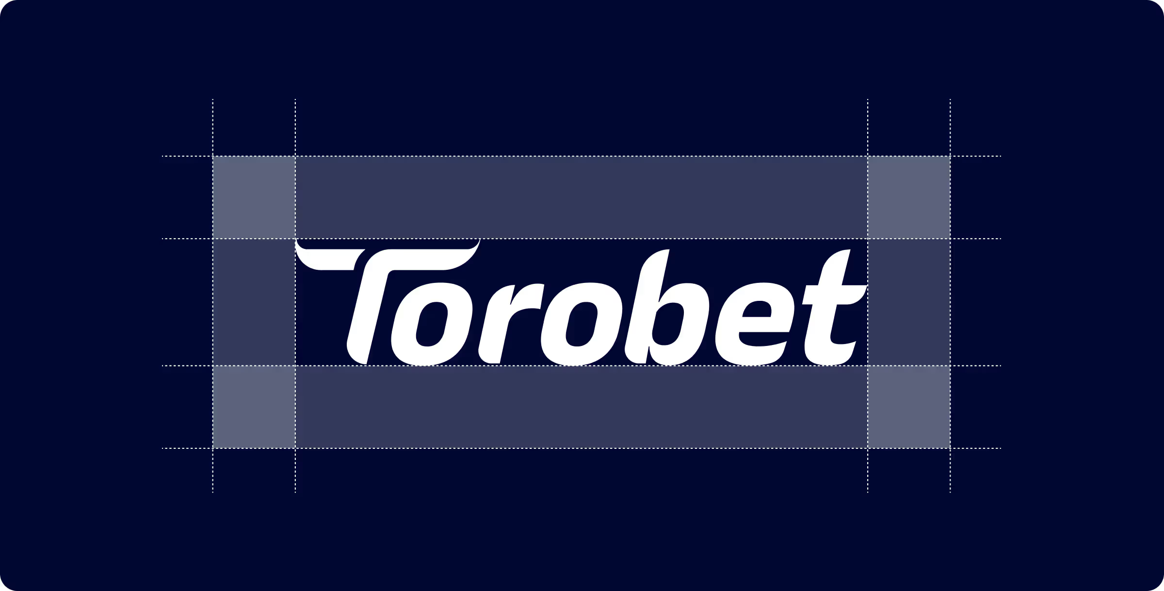


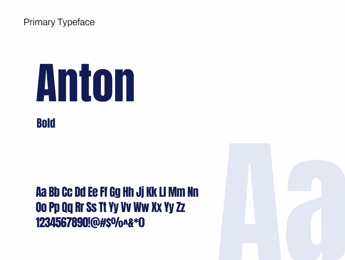
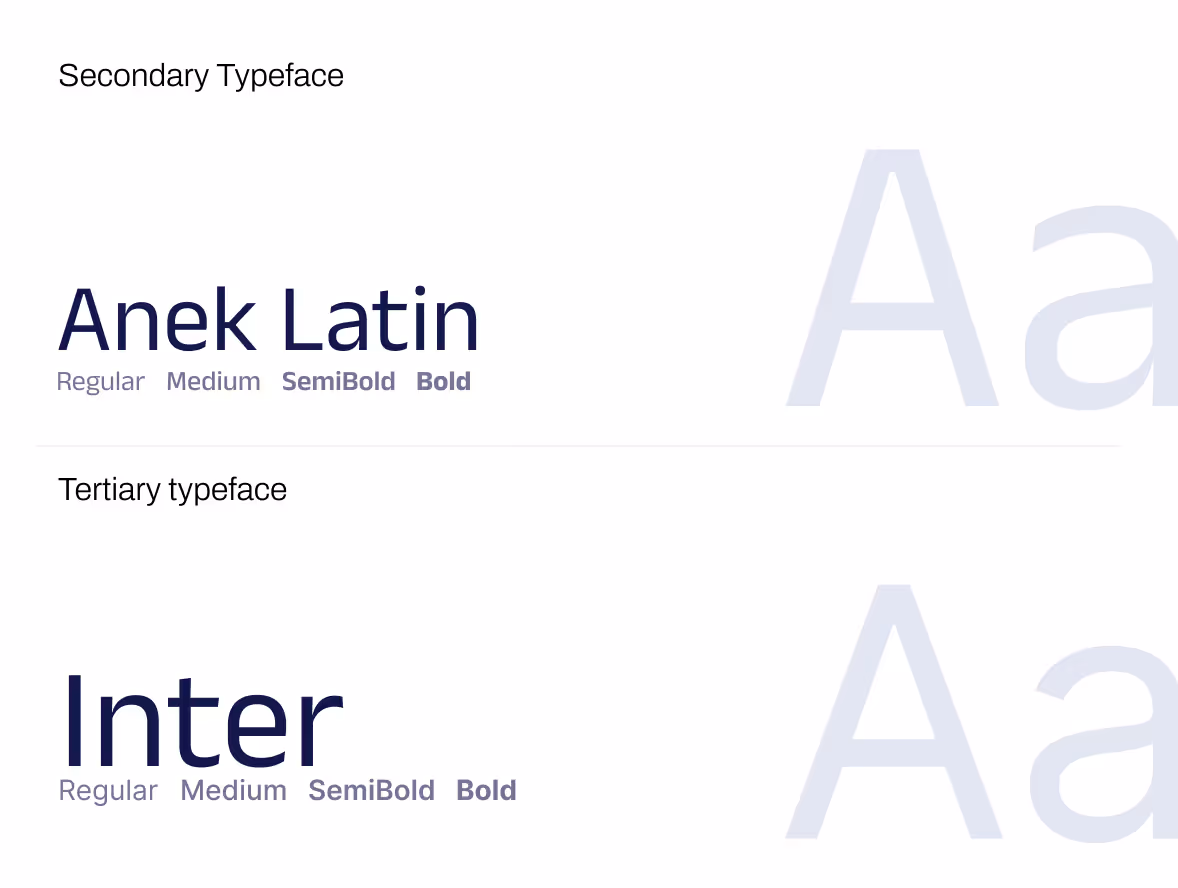
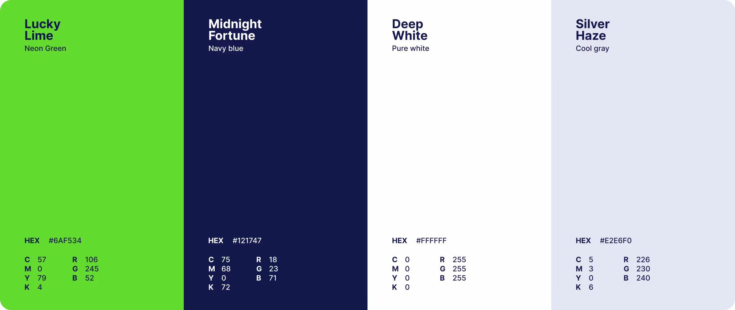
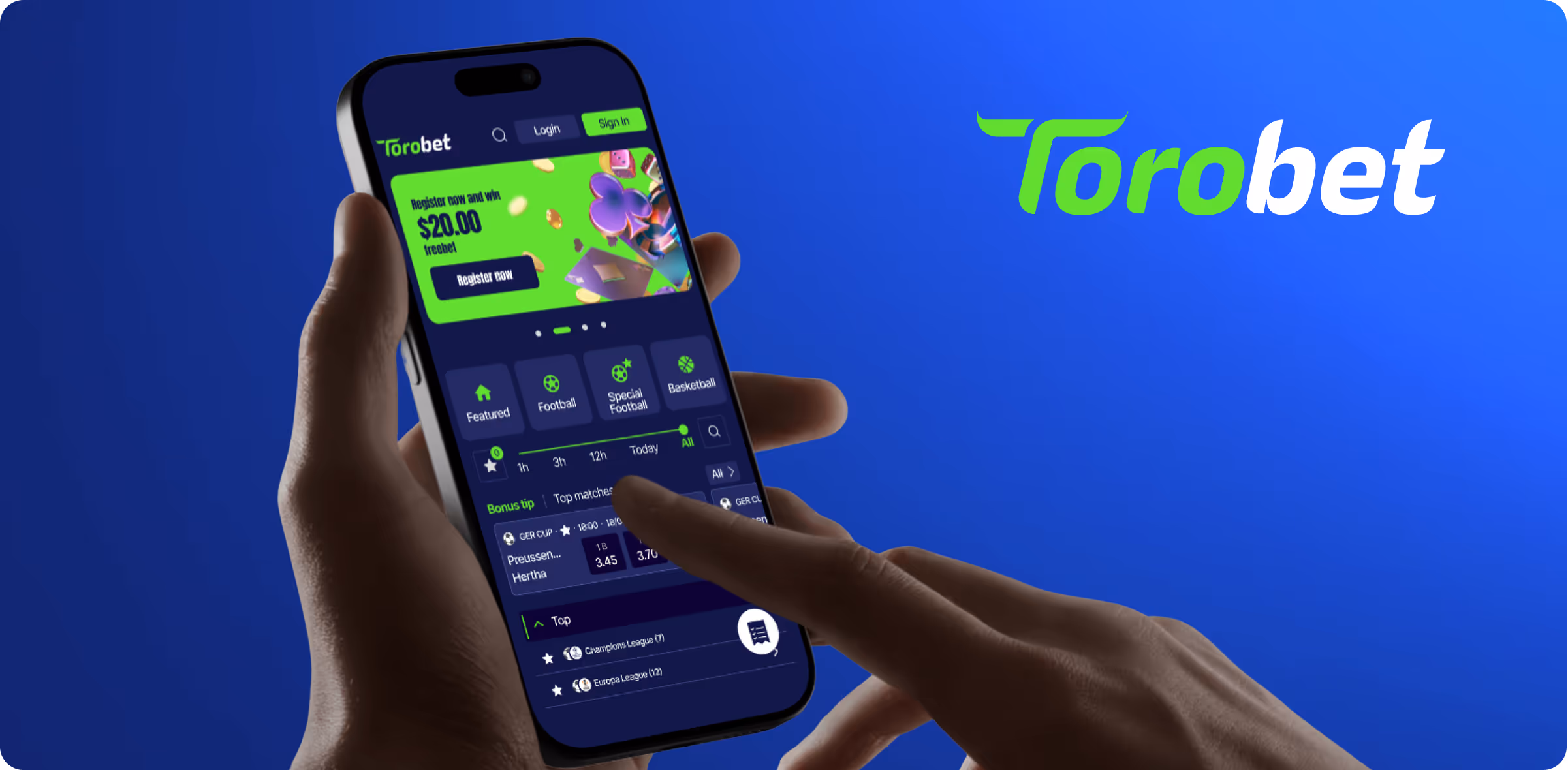
Growww engineered a completely original visual language. The logo blends bold form with digital flexibility. The color system was deliberately built from scratch—a tone never before used in the local betting space. The result: a vibrant identity that claims space, demands attention, and refuses to blend in.
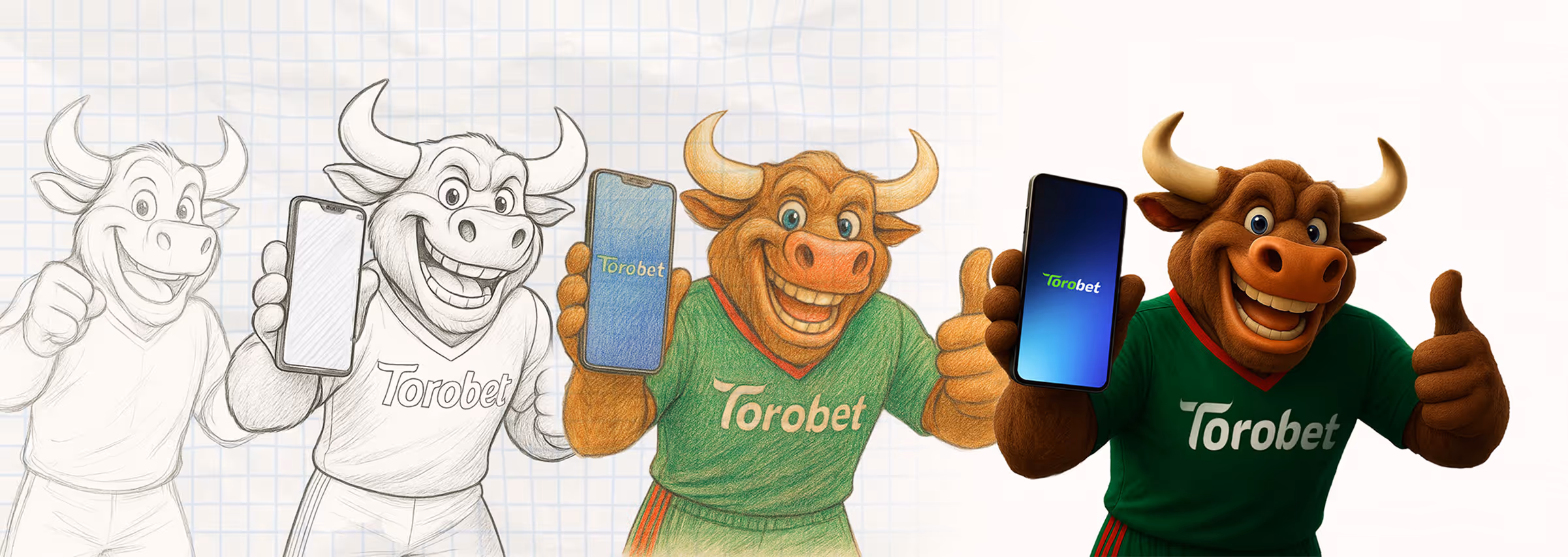
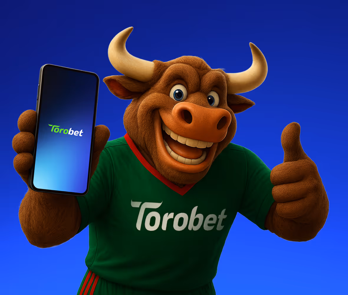
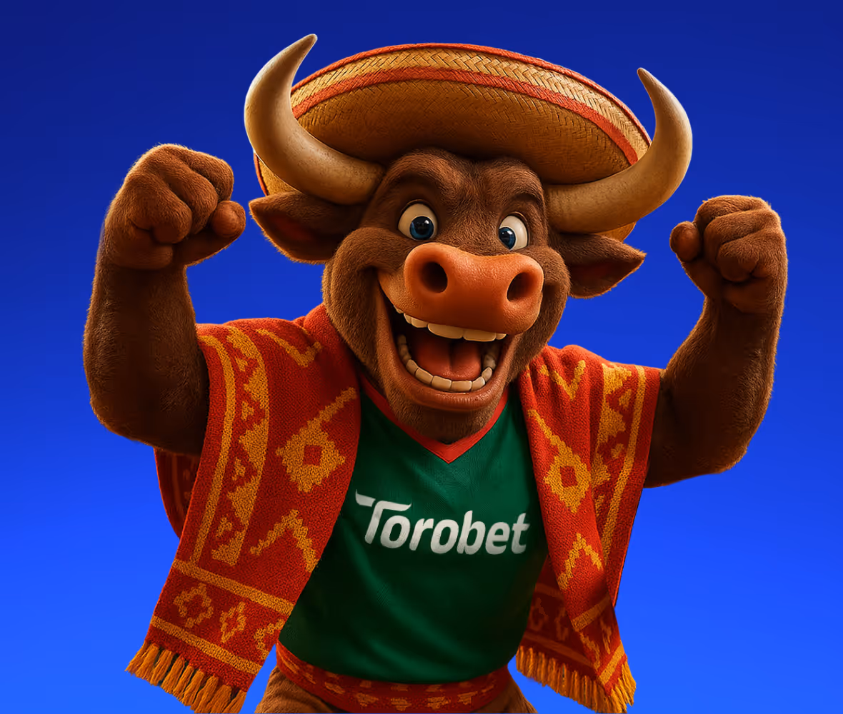
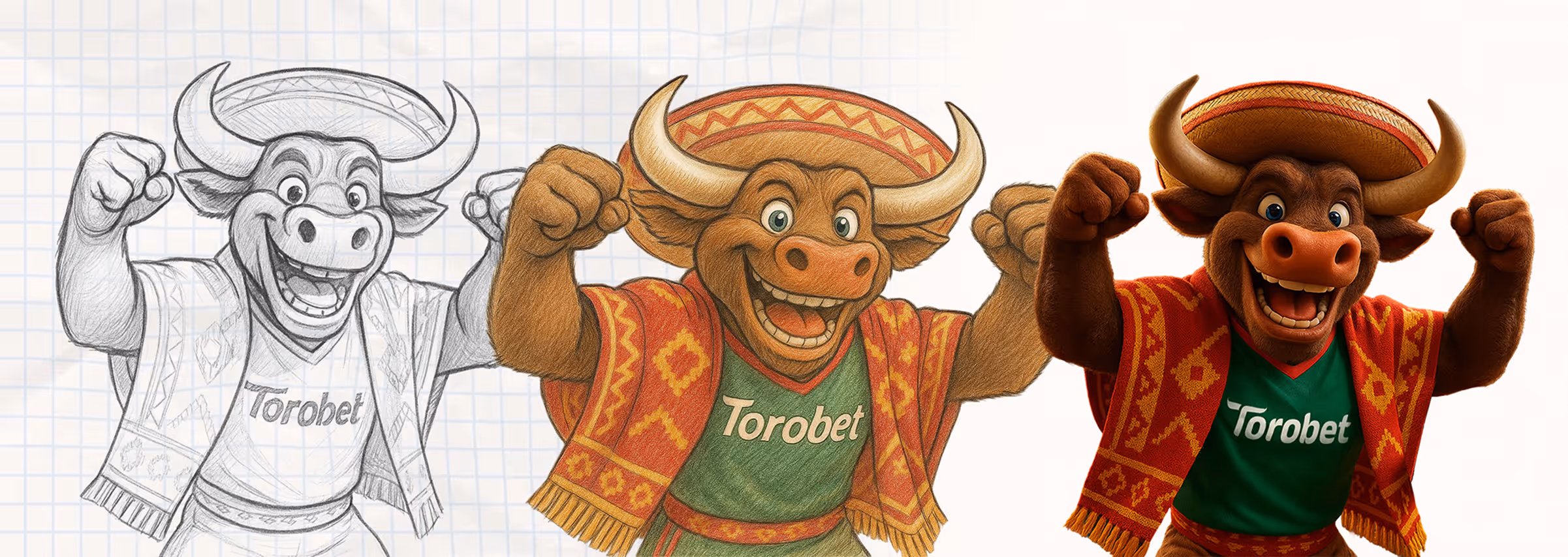
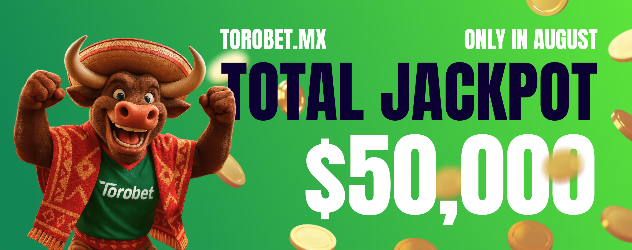
The bull drawn, modeled, and sculpted entirely in house embodies strength, precision, and cultural relevance. Developed in both 2D and 3D, it’s more than a character. It’s a symbol of identity, carrying the brand’s attitude across every digital and physical touchpoint.
We approached design as a business tool. Not decoration direction. Every line, curve, and pixel had a role: to help the user feel in control, to project credibility, and to communicate value instantly. Cultural insight met design precision to deliver a brand that’s both distinctive and intuitive.

.avif)


.avif)
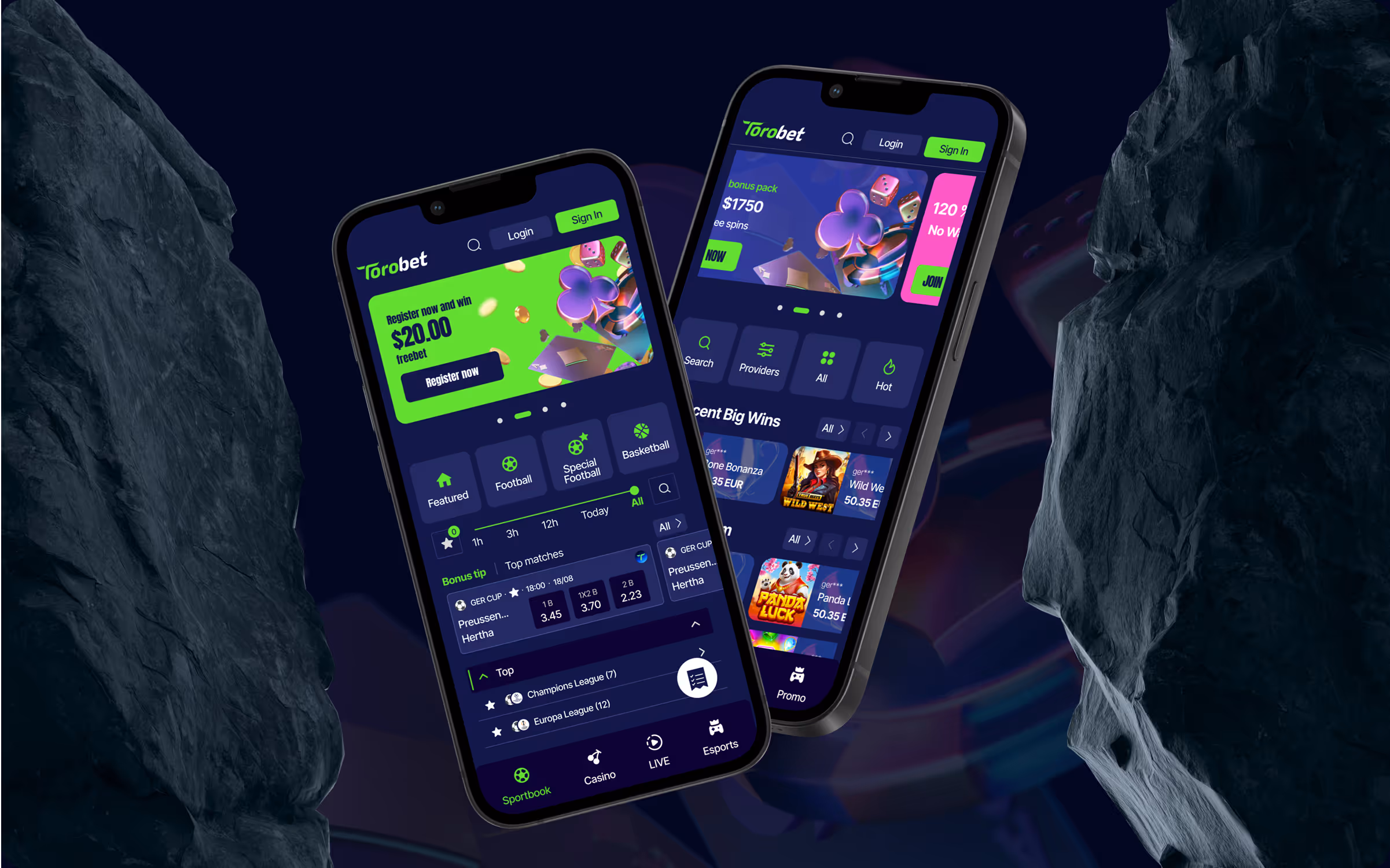
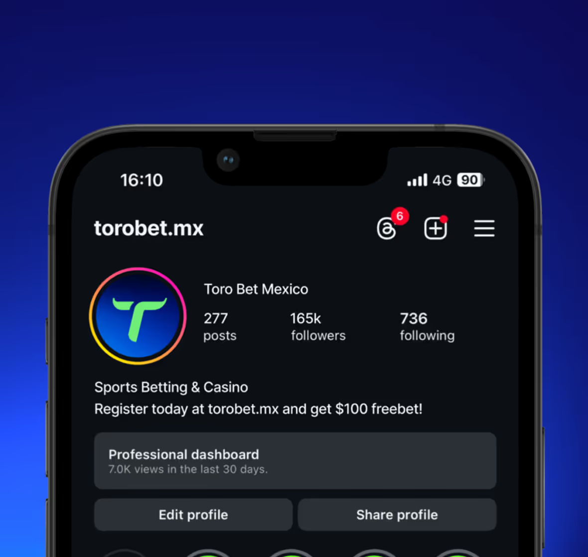
The platform’s design follows clear logic and seamless interaction patterns. The interface was shaped around user behavior, not assumptions. We gave form to speed, clarity to function, and visual rhythm to every flow building trust at every stage of the experience.
.avif)
.avif)
ToroBet no longer looks like a betting platform. It looks like a brand. Modern, confident, and unmistakably its own. With a symbol no one else uses, a voice no one else speaks, and an experience built entirely around its audience, ToroBet sets a new standard for digital gaming in Mexico.
.avif)
