

Arriba Bet entered the South American online betting and casino market with clear ambition. The goal was not to blend in or follow established visual and product patterns, but to position itself as a serious challenger to existing leaders. In a saturated and emotionally driven industry, differentiation cannot rely on promotions or odds alone. It has to be embedded in the brand, the product experience, and the speed at which users can move from intent to action.
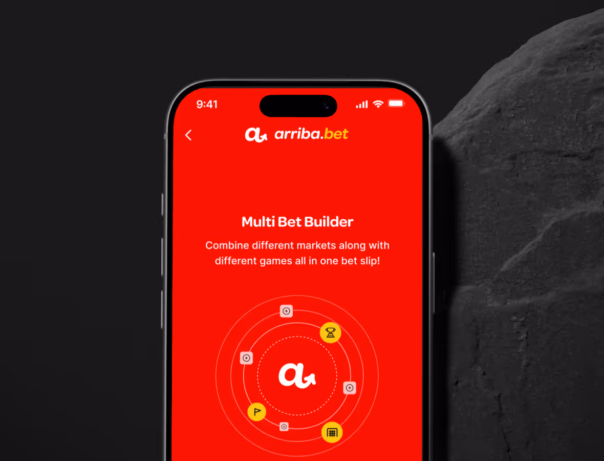
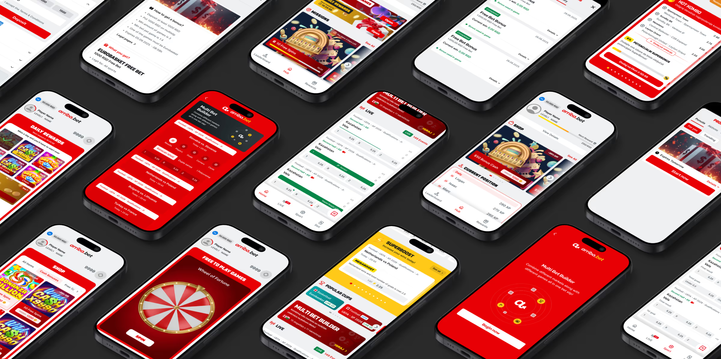
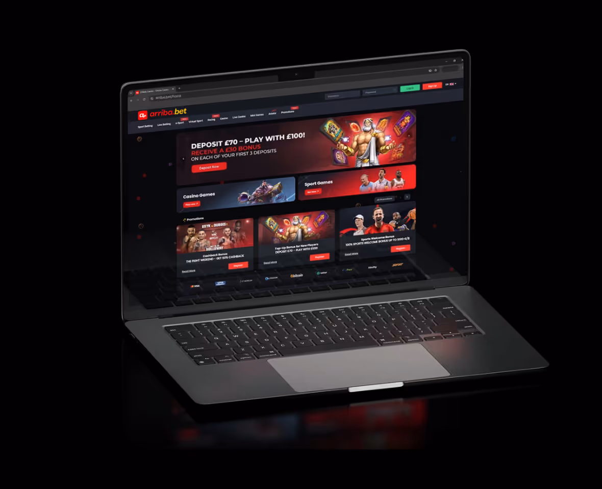
Growww was engaged to build Arriba Bet from the ground up. Our role covered the full spectrum, from brand story and positioning to visual standards, motion principles, and the complete mobile app experience. The objective was to create a platform that feels fast, confident, and instinctive, while remaining structured, scalable, and compliant with industry expectations.
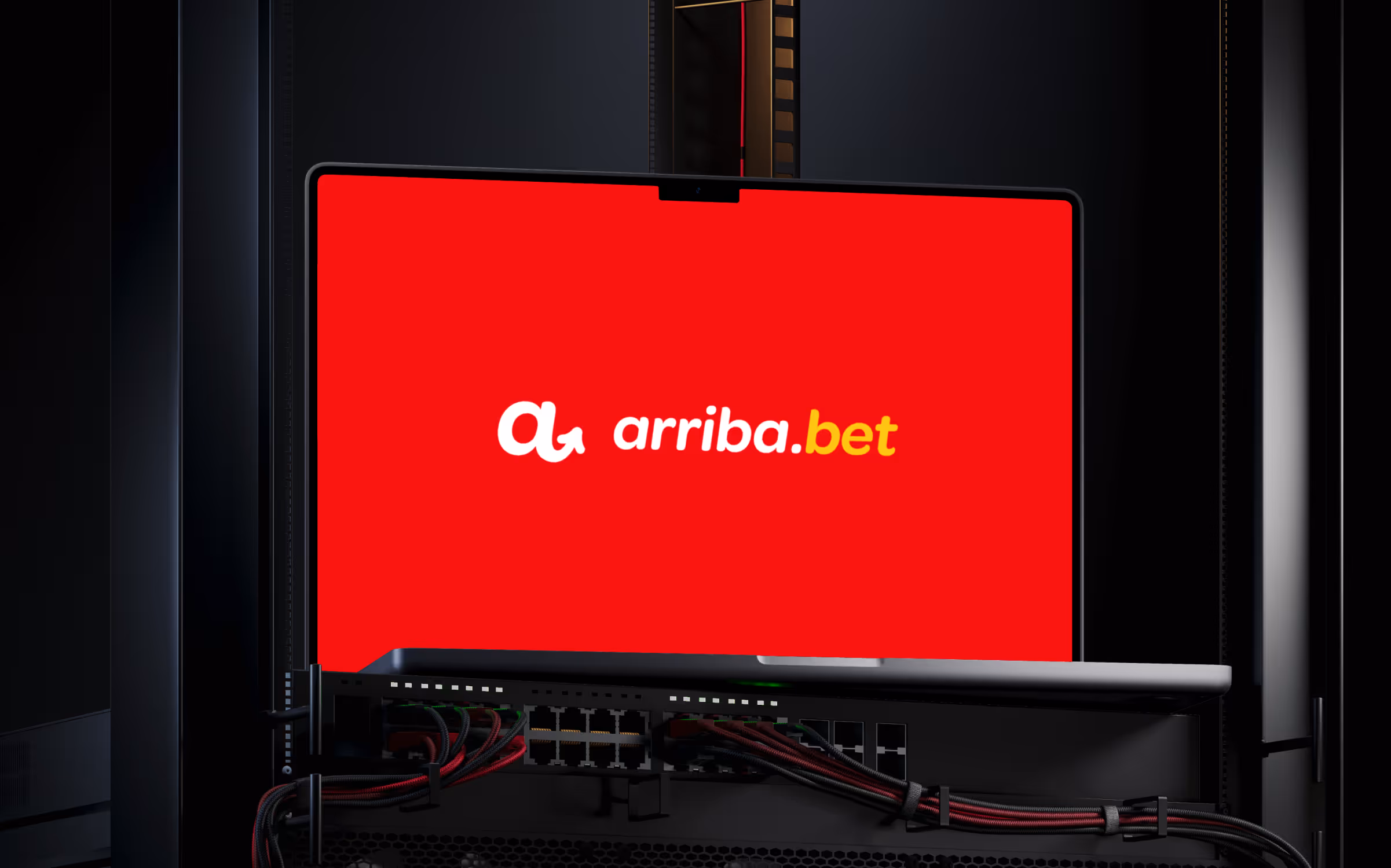
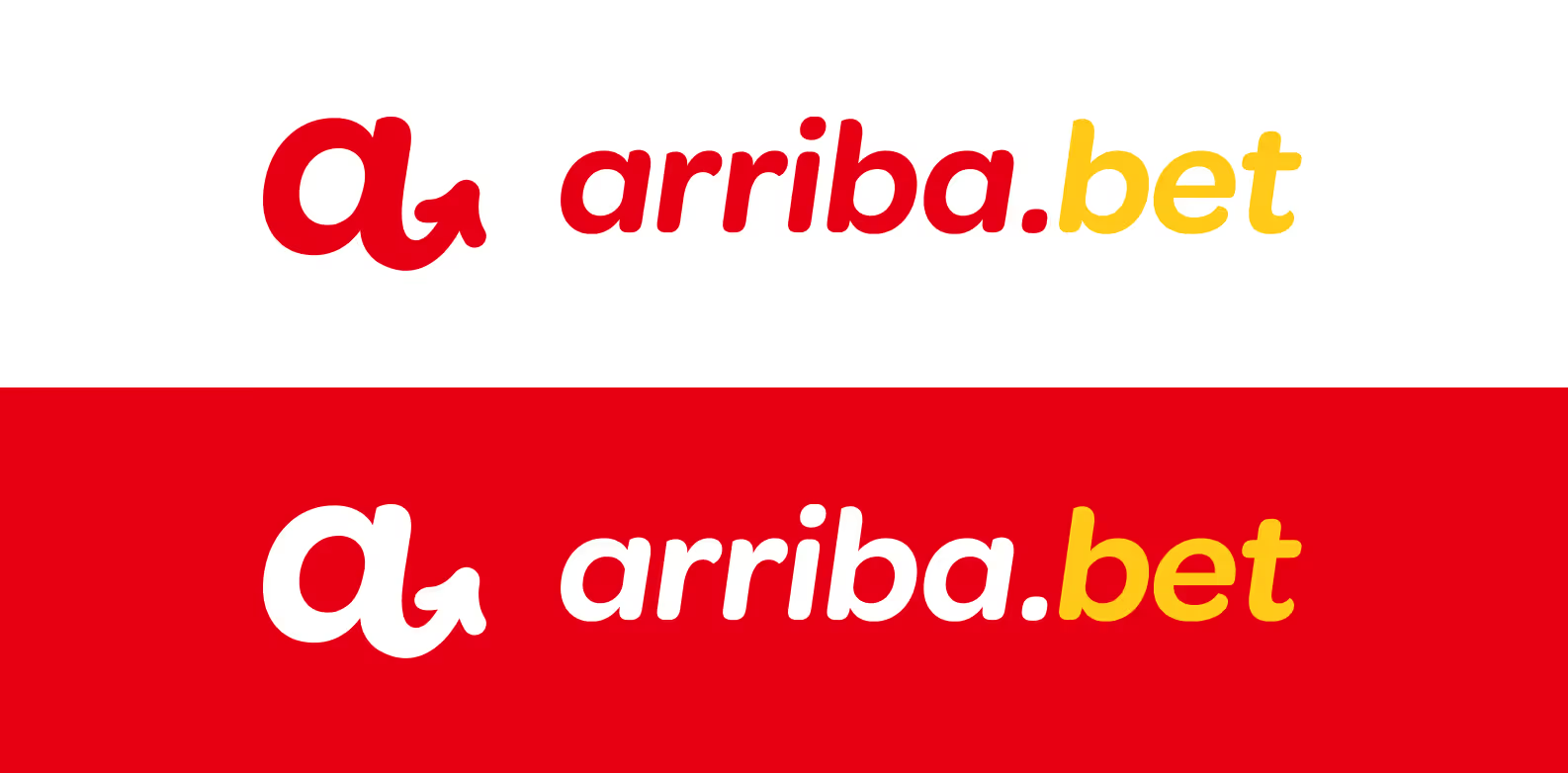
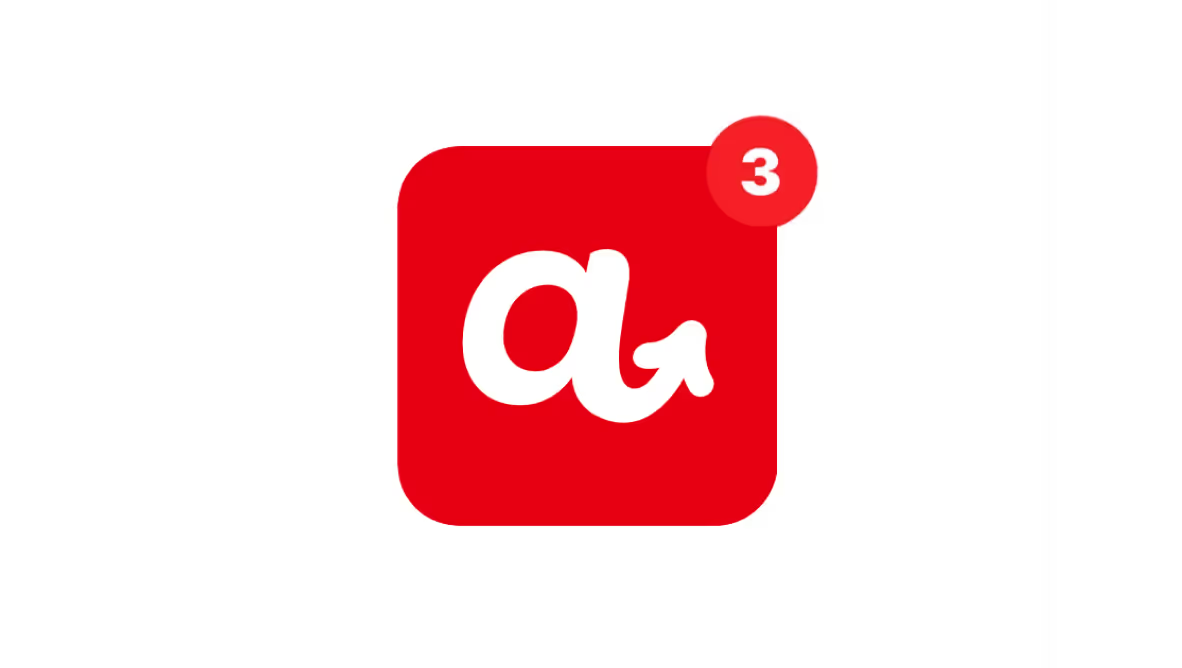
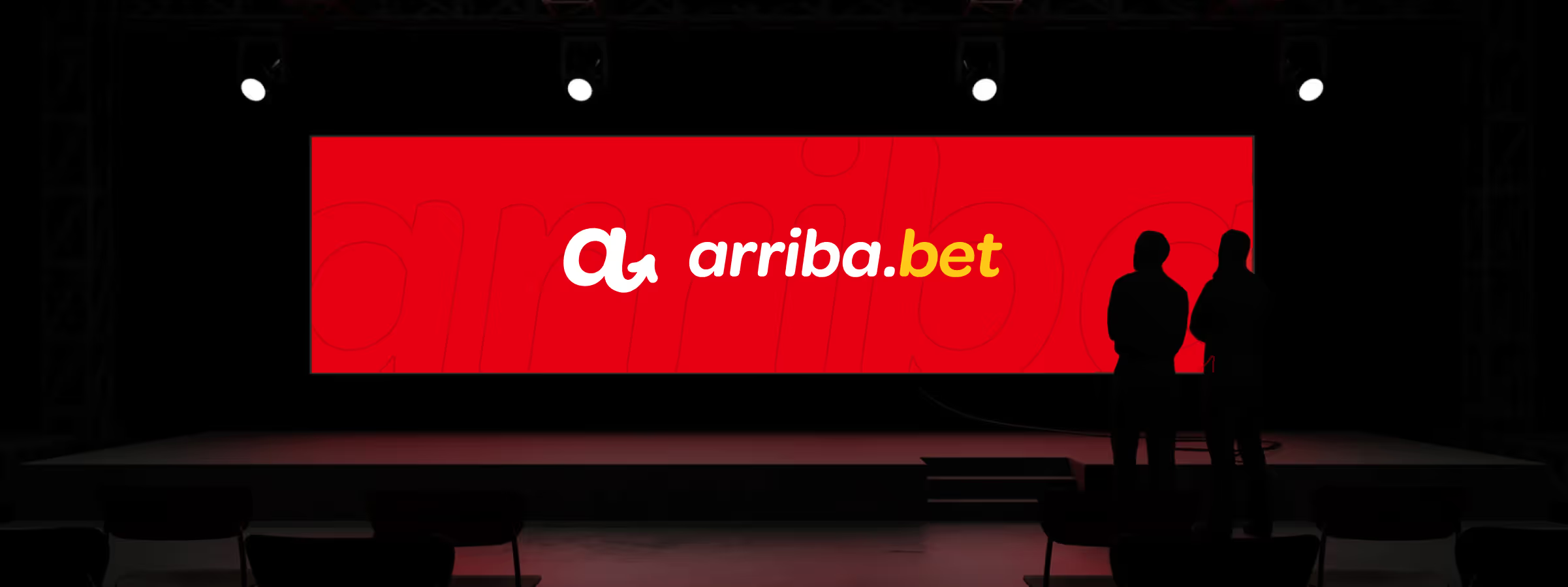
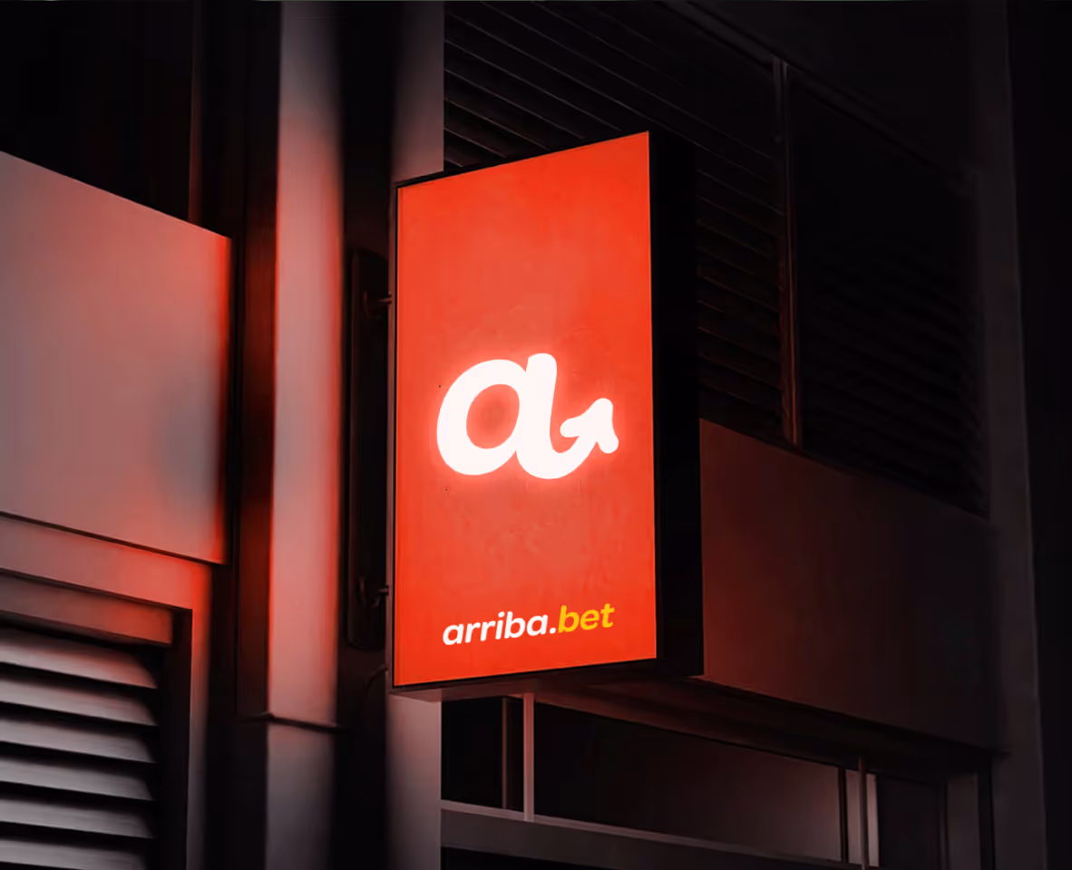
The Arriba Bet logo was designed as a functional and emotional anchor for the entire brand ecosystem, capable of working seamlessly across digital products, marketing channels, and physical applications. Its structure is based on balanced proportions and classical ratio principles, ensuring long term visual stability and consistency. This foundation allows the logo to remain clear, confident, and instantly recognizable across all sizes and environments, from mobile app icons to large scale brand placements.
At the core of the mark is a forward pointing arrow, subtly embedded as a defining visual cue. The arrow directly references the Spanish rallying cry “¡Arriba!”. This creates an immediate and intuitive emotional connection, reinforcing motivation, momentum, and the feeling of pushing forward. It transforms the logo from a purely visual symbol into a cultural signal that resonates naturally with the local market.
The wordmark is set in an italic type style to further emphasize motion, speed, and forward direction. This typographic choice mirrors the dynamics of sport and competition, where anticipation, acceleration, and quick decision making define the experience while supporting Arriba Bet’s promise of fast, focused, and purposeful execution.
.avif)
.avif)
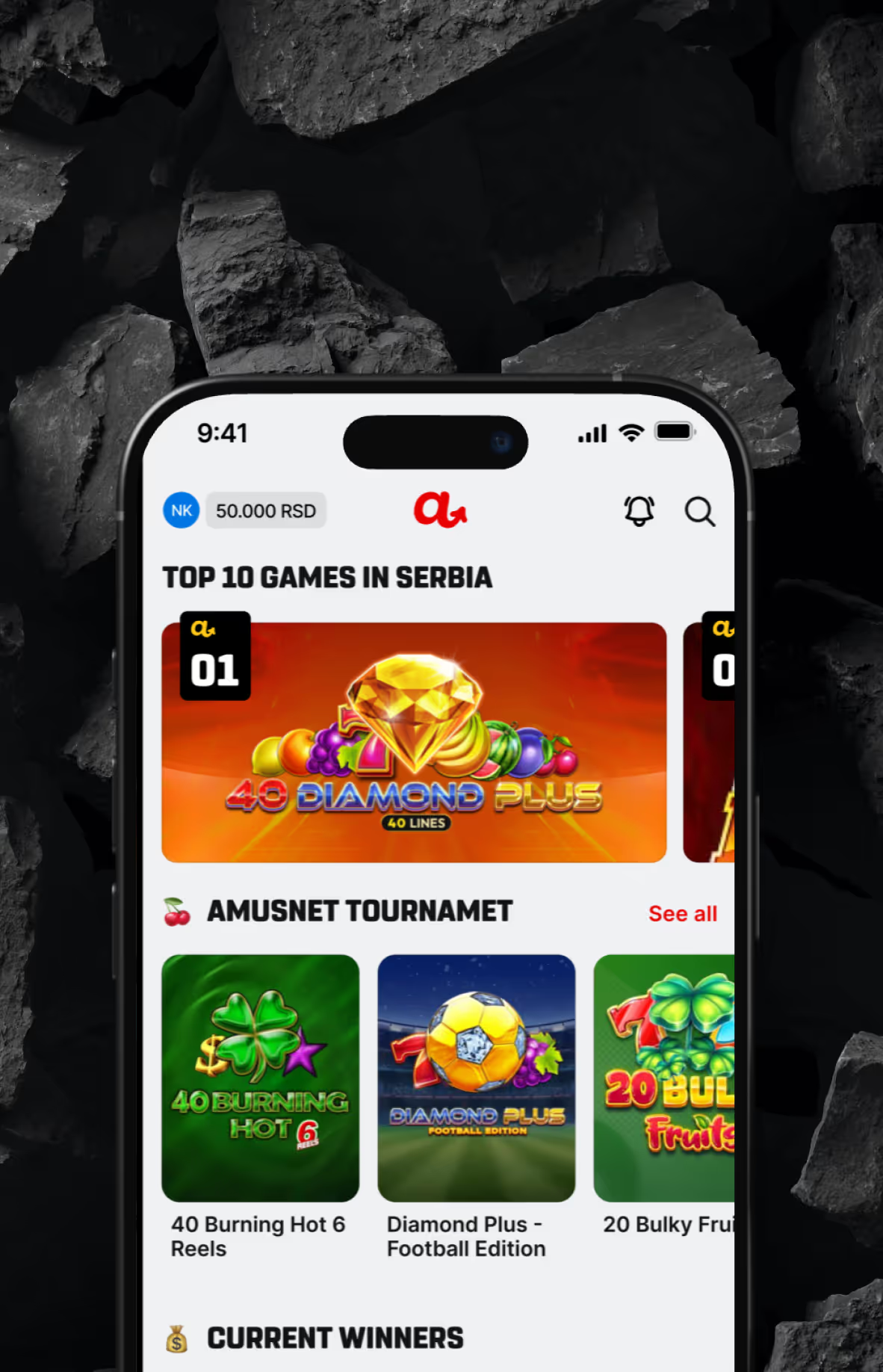
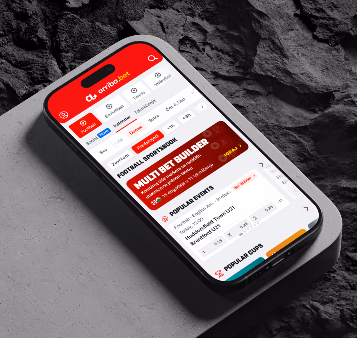
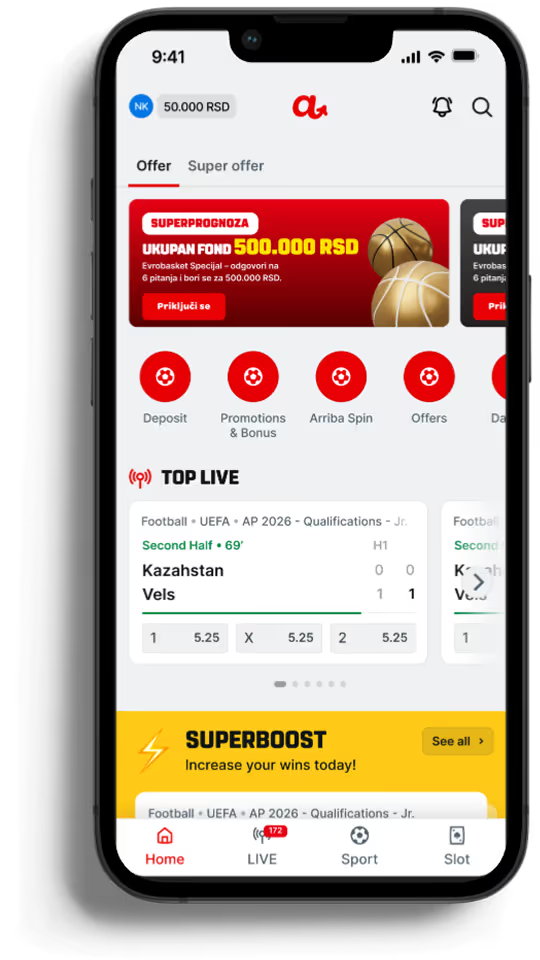
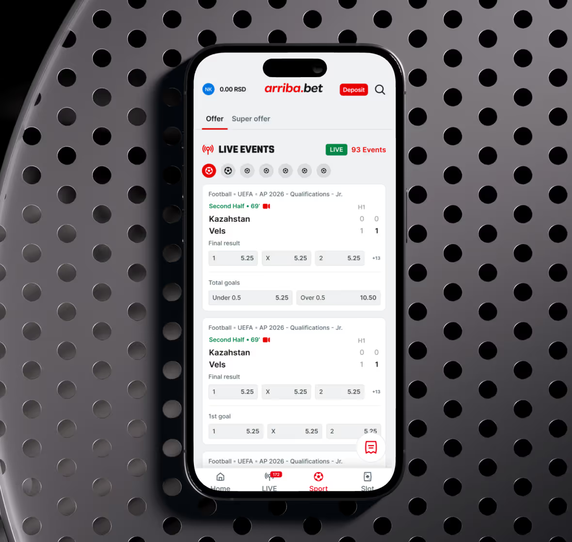
Arriba Bet’s visual system was created to trigger emotion while maintaining clarity and trust. Color selection was driven by psychology and regional context. The intense red acts as the primary driver of urgency, excitement, and action, making it ideal for bets, calls to action, and moments of decision. The energetic yellow supports optimism, reward, and winning signals, reinforcing bonuses, highlights, and key outcomes.
To balance this intensity, deep black and neutral whites were introduced as stabilizing elements. These tones bring structure, legibility, and a sense of control, which is essential in a betting environment where users handle money and make quick decisions. Together, the palette creates a rhythm between adrenaline and focus.
Typography plays an equally important role. The chosen typeface features rounded forms and clean geometry, allowing the interface to feel modern, approachable, and highly readable across devices. It supports fast scanning, clear hierarchy, and consistency across the platform, reinforcing trust without sacrificing energy.
.avif)
.avif)
We approached design as a business tool. Not decoration direction. Every line, curve, and pixel had a role: to help the user feel in control, to project credibility, and to communicate value instantly. Cultural insight met design precision to deliver a brand that’s both distinctive and intuitive.
.avif)
.avif)
.avif)
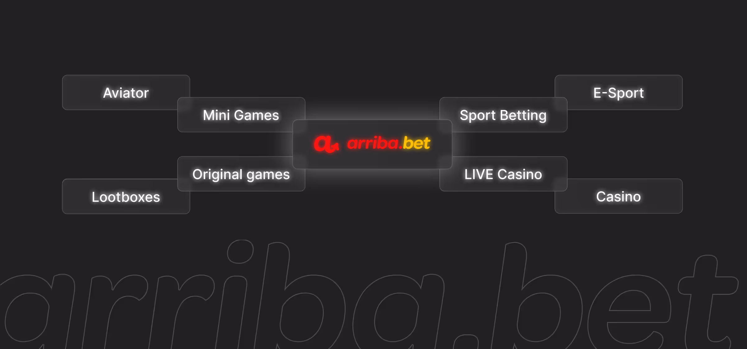
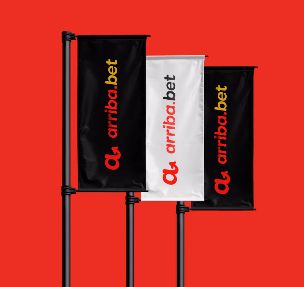
From the beginning, the brand was designed as a system, not a static identity. Every visual decision was tested against how it would scale across channels, products, and future extensions. This strategic approach ensured that Arriba Bet could maintain a strong, consistent presence across digital touchpoints, marketing materials, and offline applications.
Stationary and brand assets were designed to translate the digital experience into the physical world without losing intensity or clarity. The same principles of bold contrast, clean structure, and confident spacing were applied to all brand materials, ensuring immediate recognition and coherence regardless of context.

.avif)
Arriba Bet was designed, structured, and delivered in under four weeks. The project followed a phased approach, allowing key elements to be defined, validated, and built in parallel without sacrificing quality or consistency. This rapid execution required precise alignment, clear decision making, and a strong system driven mindset.
The final outcome is a complete brand and product foundation ready to compete in a demanding market. Arriba Bet launched with a clear identity, a scalable visual system, and a refined mobile experience that reflects its ambition to stand alongside, and challenge, established industry leaders.
.avif)
